North-Star
Design Concepts
I started with a big-picture plan for the Movement Ecosystem. Next, I focused on applying this strategy to exploring future design directions.
It includes designs from the app's early versions, some forward-looking concepts, and a practical design that bridges present and future. The work showcases UI design ideas and high-level concept visions, illustrating the hands-on design progression from past to potential future versions.
Responsibilities
Hands-on Design
Trend Analysis
Creative Problem Solving
Design Thinking
( Design ideation )
Overview
Team
1 Design Director
Goals
Explore and visualize future design directions
Develop a comprehensive visual strategy for the Movement Ecosystem
Create a design evolution roadmap from past to future versions
Starting point
( Before 2019 )
Too tech-oriented app
Not user-friendly tone of voice, too much jargon
Low contrast and readability, thin and sleek aesthetics that drove low contrast and readability
Performance issues due to mountains in the background
Not established and low recognizable brand identity
Lack of social engagement
Main pain points
( 2021-2023 )
Redesign
Continuing performance issues due to mountains in the background on Android and older phones
Only major successful flows were redesigned. Need more design love and attention
Design inconsistencies due to varying project needs and experimental approaches
Focus on steps as a main pilar for users’ interactions
Socials and competition are not very prominent
Main pain points
Gamification Updates
( 2024 )
New features using some of gamification mechanics. Because of that the app is overly colourful, and uses UI-game visual approach
Users looking for personal data and insights
Minor design inconsistencies
Circle progress bar was reintroduced. Users love it but the focal point became too cluttered
Main pain points
What’s about forward-looking concepts?
Floating gradients
( Minimalistic approach )
Core Concept. Emphasis on sleek simplicity and refined minimalism in design
Personalisation. Data and insightful analytics tailored to each end-user
Progression. Dynamic showcasing of user progress across different days
Minimalistic UI. Strategic utilization of bold, large numbers and prominent texts
Focus on Essentials. Design stripped down to basics for crystal-clear clarity and effortless user experience
Monochromatic Surrealism
( Futuristic approach )
Central Feature. Prominent 'steps' circle surrounded by complementary function circles
Dynamic Elements. Vibrant, animated circles spotlight various essential functionalities
Progress Indicator. Intuitive progress tracking similar to the core 'steps' feature
Interactive Layout. Engaging user interface with fluid movement and functional highlights
And about
practical design concepts?
Structural design
( Modular bento grid )
Modular Approach. Features versatile boxes and dynamic layouts for enhanced flexibility
Personalization and Testing. Enables customization and comprehensive A/B testing in multiple formats
Color Scheme. Elegantly minimalistic, complemented by bold, distinct accents
Adaptive Design. Sailored to accommodate diverse user preferences and evolving needs
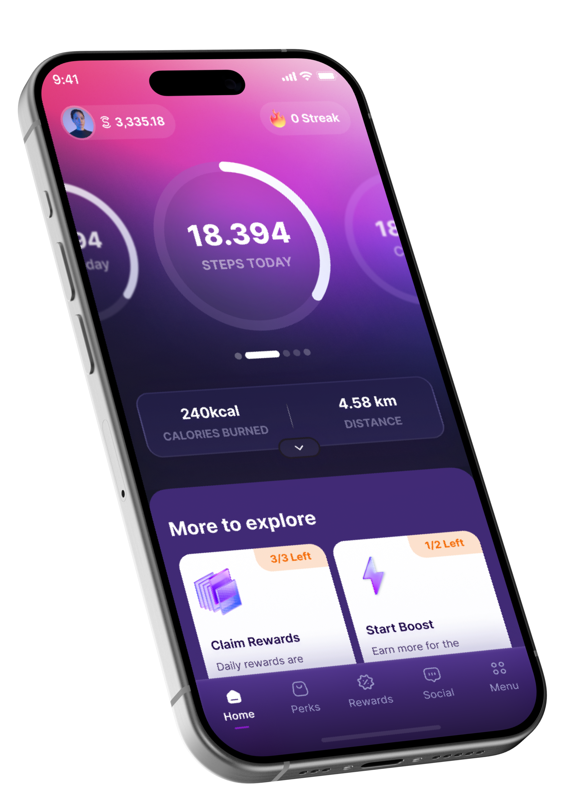
Transition version
( Swipeable circles & overlay )
Top Section Design. Features intuitive swipeable circles for diverse metrics
Expandable Box. Reveals additional metrics below the circles
User Interaction. Enables smooth scrolling to explore extensive app featuresImmediate Visibility. Enticing rewards and motivating boosts are prominently displayed from the start
Dynamic Layout. Engaging swipeable elements combined with versatile expandable sections for enhanced user engagement
Summary
In the end, we picked two options to move forward with:
We decided to simplify the current app version into a Transitional Design version. We chose the Structural design concept with a modular bento grid as our North Star for future design evolution..


