
Cultural design language fit
Making a Middle East fintech prototype
feel credible for Western investors
Client
Fintech investment platform for capital investment companies and fund managers
Context
Prototype built with freelancers for a Middle East first market. The Western audience needed to access funds, track money movement, and understand performance.
My role
Audit the prototype from a Western investor's perspective. Assess clarity, credibility, and the maturity of the design language for a first pitch. Flag the highest-risk issues, then propose a realistic direction for upgrading without a full redesign.
Executive summary
The bigger problem is trust posture. The prototype has a clear visual foundation. Spacing, typography, and component consistency are already moving in the right direction. Western investors evaluate competence through precision. Data context, auditability, and "how fast I can understand risk and performance" matter more than aesthetics.
My audit was focused on:
Shifting the experience from consumer-grade simplicity to investor-grade clarity
Adding more context
Building a stronger hierarchy
Better data integrity cues
Fewer ambiguous screens in the pitch
What I Reviewed
The screens provided by the client
Core flows and screens that shape the first impression and trust
Portfolio and fund overview patterns
Fund detail and performance patterns
Holdings representation and scanning behaviour
Money movement visibility and status clarity
Global system language: numbers, currency formatting, states, and navigation
Success Criteria
Since this was pitch-focused, we aligned on practical outcomes.
Primary outcome: A Western investor can understand what this platform does in a 5-minute demo without asking basic clarification questions.
Leading indicators
Faster comprehension of portfolio value, performance, and cash movement
Fewer questions about how numbers are calculated
Clearer confidence in data freshness, source, and status states
Stronger perceived credibility of the team and product maturity

This platform is serving two jobs
Investor view. Evaluate funds, performance, and money movement with confidence
Fund manager operations. Run the fund workflow with high density and operational control
The major gap
What the product needs to communicate
Precision and control in a high-trust domain.
What the prototype currently communicates
Clean UI, but limited financial depth and limited auditability. This is the classic pitch risk. The interface looks nice, but it does not prove competence.
Design Direction
I recommended a sharp decision for the pitch
Pick one primary persona for the first pitch experience. Investor views first. Fund manager tooling second.
Why? It reduces ambiguity, strengthens the story, and lets the team focus on trust and clarity instead of breadth.
What to cut for the first pitch? Operational tooling depth that creates cognitive load without increasing investor confidence.
Practical Recommendations
To make the audit actionable, I framed improvements as concrete screen upgrades
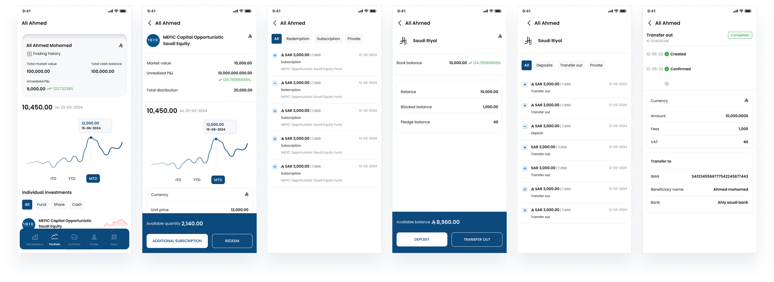
Performance Chart
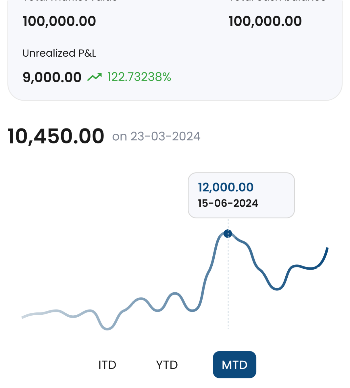
Current solution
Design change
Current solution
Current solution
A clean chart shape, but unclear interpretation without scale, baseline, and reference. The graph is decorative, not functional. It lacks scale, reference values, axis, correct hover data, indicators, currency, and more
Design change
A chart that answers: what period, what return, what last value, what changed, and compared to what. Same visual style, more meaning, more confidence. A more informative graph that shows the current portfolio value, highs and lows, data for all the time, divided by sections, and precise data for the timestamp
Upgrade Charts from Decoration to Decision Support
Investor-grade charts do not need to be complex. They need to be interpretable.
What I recommended adding
Clear time ranges aligned to investor questions (1W, 1M, YTD, 1Y)
Baseline and reference context (start value, benchmark placeholder if available)
Precise values on key points (high, low, last)
Clear labelling that explains what the chart represents
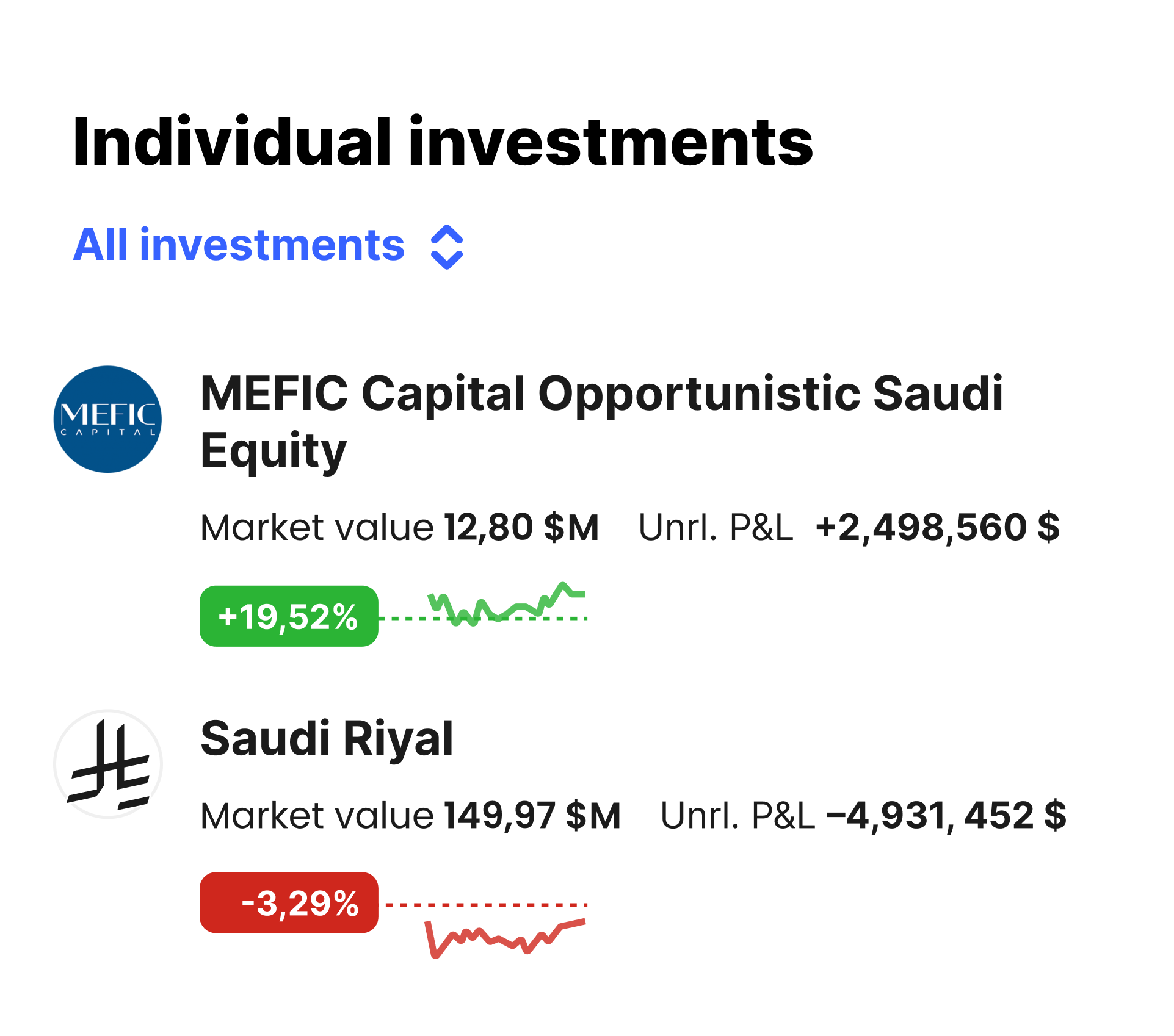
Individual holdings List
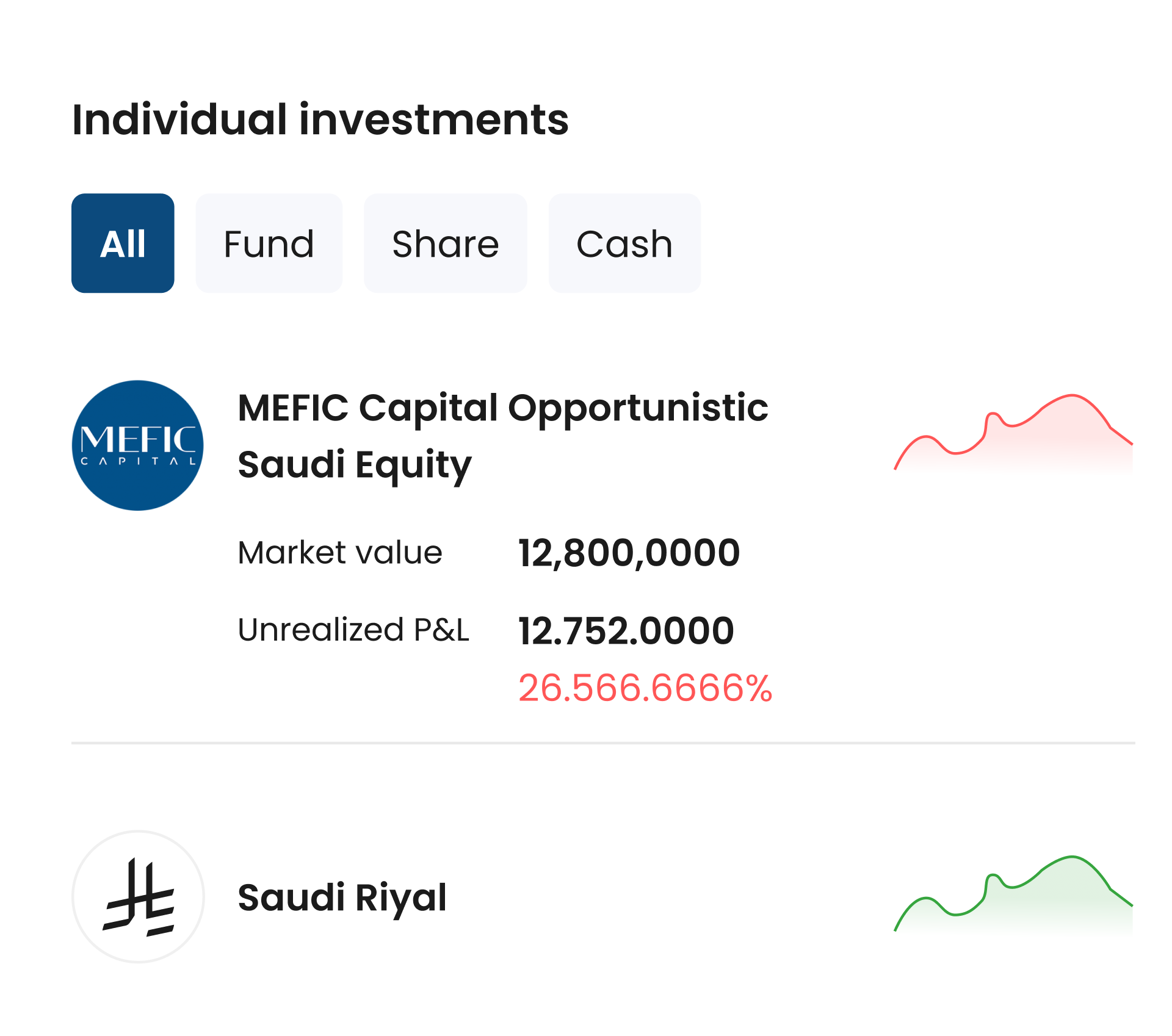

Design change
Current solution
Visually pleasant cards, but slower to compare holdings and understand what drives movement. Funds entities are aesthetic and not informative. They show the data, which is not close to the real one. Unrealised P&L shows a total number that is hard to scan
Design change
A compact list pattern with clearer totals, stronger delta hierarchy, and standardised numeric rhythm. Same content, faster cognition. Better user focus and scanning of important information. Separate the market value and unrealised P&L more clearly. Introduce trend indicators like +19,52% to replace raw percentage text for faster scanning
Make Holdings Instantly Scannable
Holdings need to answer: what it is, what it's worth, how it changed, and why it matters.
What I recommended changing
Separate "value" and "change" visually and semantically
Standardise the delta pattern (amount + percent, consistent placement)
Add compact tags for category, risk, or fund type when relevant
Reduce card-like decoration and increase data density in a controlled way
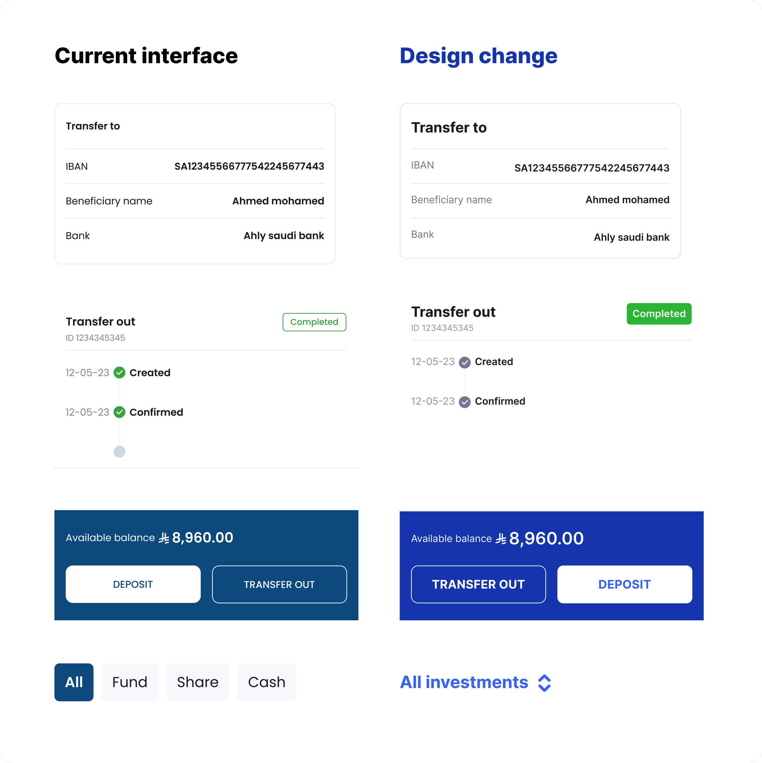
What I recommended
Last updated timestamp and clear freshness language
A status timeline for transfers and movements (submitted, pending, completed, failed)
Confirmations that feel auditable, not casual
Consistent state design across the product
Currency formatting rules
Decimal rules per metric type
Negative value conventions (minus vs parentheses)
Rounding strategy and consistency across screens
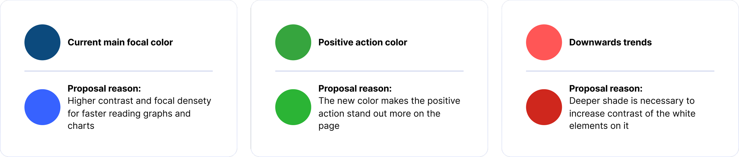
Color scheme changes
The current colour scheme works well. However, there are some minor changes that could be made. I suggest increasing the colours’ intensity to make it more scannable for a data-heavy functional interface
RTL
LTR
Key Findings
The Strategic Issue: Credibility Over Aesthetics. The prototype optimises for visual polish while undermining financial credibility. In investor pitches, perception of competence matters more than design trends. Mixed UI patterns create ambiguity—the opposite of what fintech demands.
Critical Trust Gaps. Financial data presented without context (no baselines, audit trails, or interpretability). Money movement lacks verification cues. Number formatting is inconsistent—a red flag in financial products where precision signals competence.
Clarity & Navigation Issues. Information hierarchy collapses totals and details into a single level. Actions are visually buried. Holdings require cognitive effort to scan. The interface feels cluttered despite modern styling.
System Refinements. Contrast, typography, and internationalisation need systematic treatment, details that compound credibility in investor eyes.
What I Delivered
Prioritised audit aligned to investor perception and pitch strategy. Clear recommendation on product posture (investor-first vs. user-first). Concrete direction for rebuilding trust through precision: numeric systems, audit trails, scannable hierarchies, contextual charts.
Strategic Insight
This reinforced a fundamental principle: modern design ≠ trustworthy product. In fintech, investors read competence through precision, context, and auditability. The highest-leverage move wasn't component redesign. It was repositioning the product's narrative and installing small trust cues that signal professionalism at a glance. Once the team aligned on investor credibility as the north star, execution became clear.
Continue exploring advisory work for startups and scaleups

Advisory project
Mobile App Retention Advisory
Mobile app advisory case on retention strategy, behavioural UX, and engagement design for a reward-based product. Focused on competition mechanics, fake door testing, and scalable concepts to improve repeat usage and long-term retention.
Industry: Play-to-Pay
Focus: Retention, behavioural UX, engagement design
Role: Design Advisory
Product design case studies